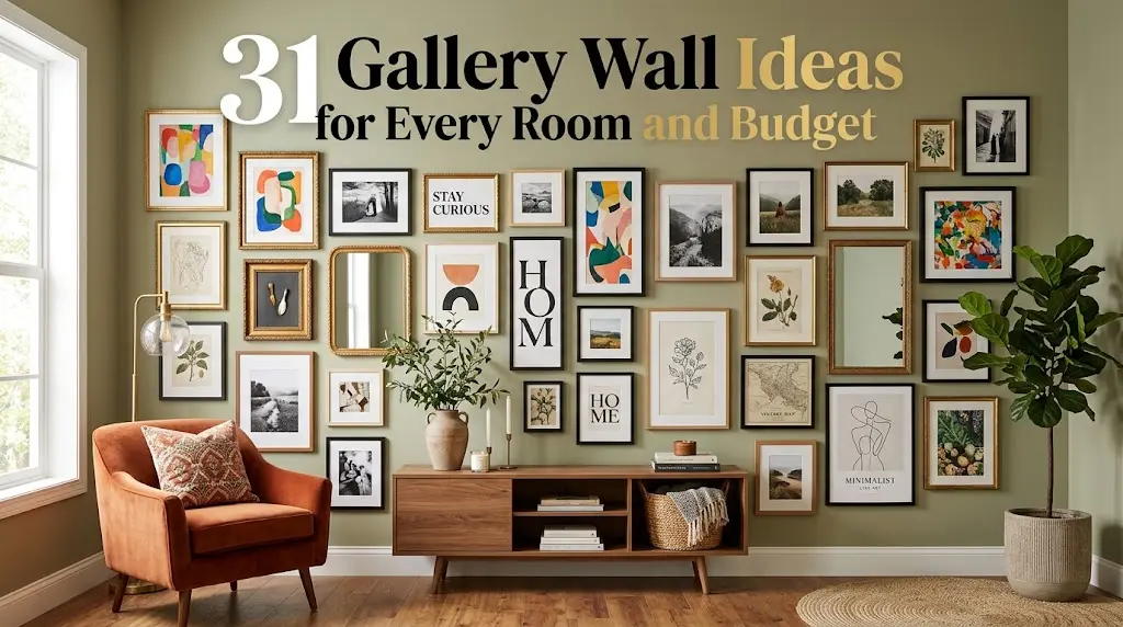
31 Gallery Wall Ideas for Every Room and Budget
A blank wall rarely looks unfinished until you try to put something on it. Then the questions start: grid or cluster, matching frames or a mix, and how high is too high? The best gallery wall ideas answer those questions with a clear plan rather than a pile of frames hung one at a time. This collection covers 31 distinct approaches, from renter-friendly picture ledges and thrifted frame collections to custom picture rails and lit art walls. You’ll find layouts for living rooms, stairways, bedrooms, kitchens, and narrow hallways, plus notes on frame color, spacing, and scale. Use them as a starting point, then adapt the arrangement to your own wall, your own art, and your own budget.
1. The Classic Grid Above the Sofa
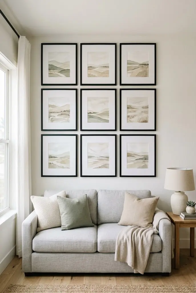
A grid is the most orderly gallery wall layout: identical or near-identical frames in even rows with equal gaps. It suits living rooms with a strong horizontal piece below, such as a sofa or console. A 2×3 or 3×3 arrangement in black or white frames with wide white mats reads as calm and deliberate, even when the prints inside are very different.
- Keep gaps consistent, commonly around 2 to 3 inches.
- Match frame depth and color, and let the art supply the variety.
- Center the whole grid over the furniture, not the wall.
Common Mistake: Hanging each frame by eye. Better Approach: Mark every nail position on paper first, then tape the paper to the wall. Even a small drift ruins a grid.
2. Salon-Style Cluster With Mixed Frames
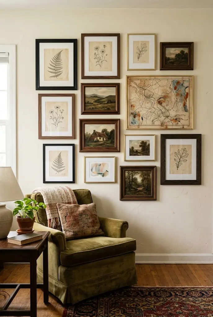
Salon-style walls fill the space with frames of different sizes, shapes, and finishes, packed closer together than a grid would allow. The trick to keeping it collected rather than chaotic is a consistent outer shape. Aim for a loose rectangle or oval, with the largest piece slightly off-center and smaller frames orbiting it.
Mix wood, black, and brass finishes, but repeat each at least twice so no single frame looks like a mistake. Vary orientation, too. Verticals, horizontals, and one or two squares keep the eye moving.
Quick Tip: Lay everything out on the floor first, photograph it, and hang from the photo.
3. Picture Ledge Gallery Wall (Renter-Friendly)
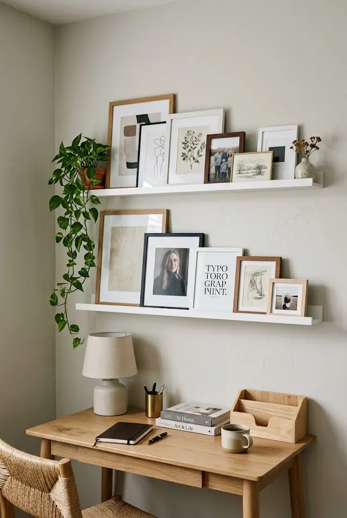
Narrow picture ledges let you lean frames instead of hanging them, which means fewer holes and effortless swaps. Two or three ledges stacked with 4 to 6 inches between them can hold large frames in back and small ones in front, overlapping for depth.
This is one of the most flexible gallery wall ideas for renters and anyone who changes their mind often. Rearrange seasonally, add a small plant or ceramic bud vase, and prop a mirror among the art.
| Option | Effect | Best Fit |
|---|---|---|
| Single long ledge | Clean, minimal line | Above a sofa or bed |
| Two stacked ledges | Layered, more art capacity | Living rooms, offices |
| Short ledge cluster | Casual, offset look | Hallways, small walls |
4. Staircase Gallery Wall That Follows the Rise
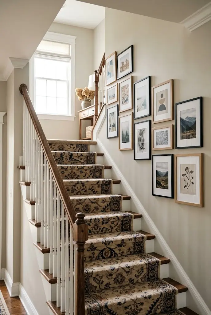
A staircase wall is a gallery wall’s hardest and most rewarding layout. The key is to follow the angle of the stairs. Keep the bottom edge of the lowest frame in each vertical column roughly parallel to the stair line, and step the arrangement up with the rise.
Use frames in a limited palette, say two finishes, so the angle itself becomes the design feature. Light, shallow frames work best where people brush past.
- Trace the stair slope on kraft paper.
- Place the largest frames near the landing, where there’s room to view them.
- Fill the gaps with smaller pieces following the diagonal.
Editor’s Note: Check sightlines from both the top and bottom of the stairs before committing.
5. Black-and-White Photography Wall
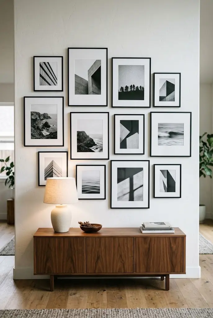
Limiting the palette to black-and-white or monochrome prints lets you mix subject matter freely. Architecture, landscapes, portraits, and still lifes all feel related. Use uniform black frames with white mats, or go with thin natural wood for a slightly softer look.
A mix of sizes works, but keep one dominant large print as the anchor.
- Use the same mat width on every piece.
- Mix horizontal and vertical orientations.
- Keep one or two tonal outliers, like a warm sepia, only if they’re intentional.
6. One Oversized Piece With Small Satellites
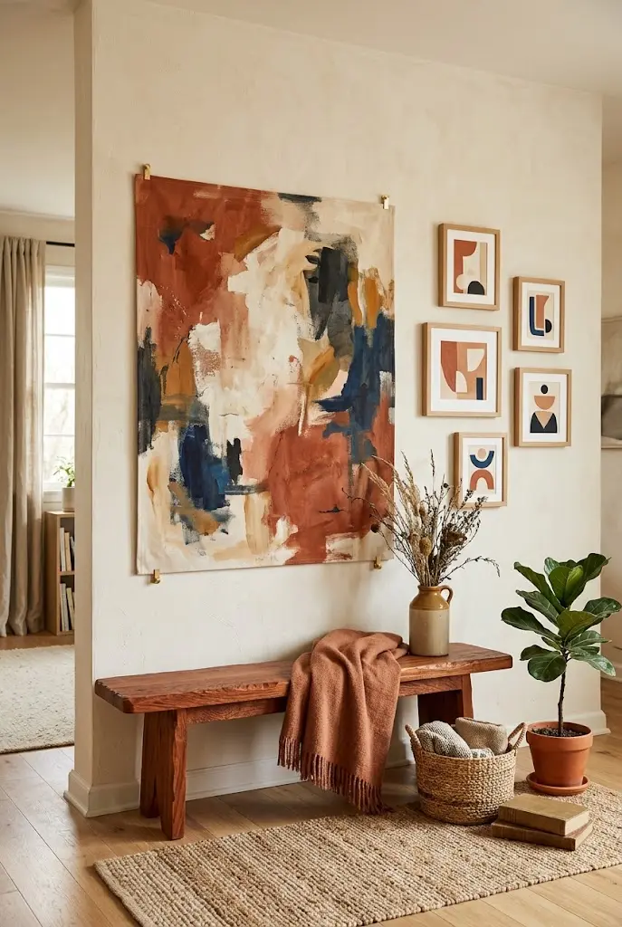
If a full gallery layout feels like too much, start with one large artwork and surround it with three to five small frames. The large piece sets the scale, and the satellites echo its colors. This is a good fit for people who own one piece they love and a few small ones.
Do: Pull one accent color from the large piece into the small frames’ prints.
Don’t: Cluster the small frames on one side only, which can make the wall feel lopsided rather than layered.
7. Gallery Wall Built Around a Mirror
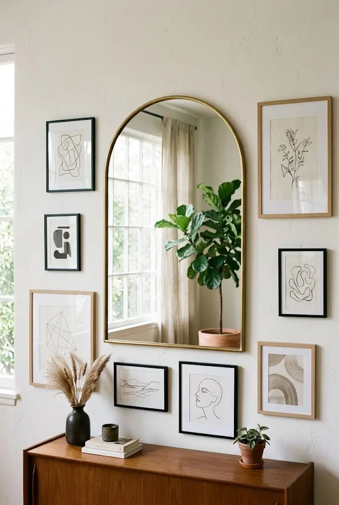
A mirror can be the center of a gallery wall, and it brings light into the grouping. An oversized round or arched mirror works well with surrounding rectangular frames, because the contrast of shapes keeps the layout interesting.
Place the mirror where it reflects a window or a pleasant part of the room. Frames should sit close enough to read as one composition, usually 2 to 4 inches away.
Quick Facts
Best For: Entryways, dining rooms, living rooms
Investment: Accessible to moderate
Visual Effect: Adds depth and brightens the wall
8. Entryway Gallery Above a Console
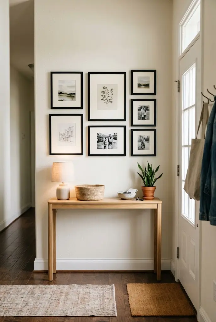
A narrow entry wall is a smart place for a compact gallery wall, since it’s the first thing people see. Keep the arrangement about two-thirds the width of the console below it so the proportions feel intentional.
Pair it with a mirror for a last look before leaving, and a few hooks or a tray for keys. Stick with a limited palette here, because entry walls can feel busy fast.
- Hang the lowest frame about 6 to 10 inches above the console.
- Use shallow frames if foot traffic is tight.
- Add a small sconce if you have a hardwired spot.
9. Bedroom Gallery Wall Above the Headboard
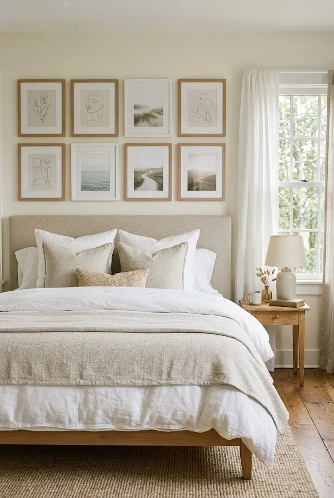
Above a bed is a natural spot for art, and a gallery wall can make a plain headboard feel anchored. Keep the arrangement restful: soft imagery, cohesive tones, and enough open wall between the art and the ceiling.
A common guideline is to keep the grouping a little narrower than the headboard so it sits within the bed’s frame. Choose lightweight frames and secure them well, since they hang over a sleeping area.
Tips & Tricks
- Pick prints in the same color family as your bedding.
- Use secure hanging hardware rated for the frame’s weight.
- Consider a mix of line drawings and soft photography for a calm feel.
10. Botanical Print Wall
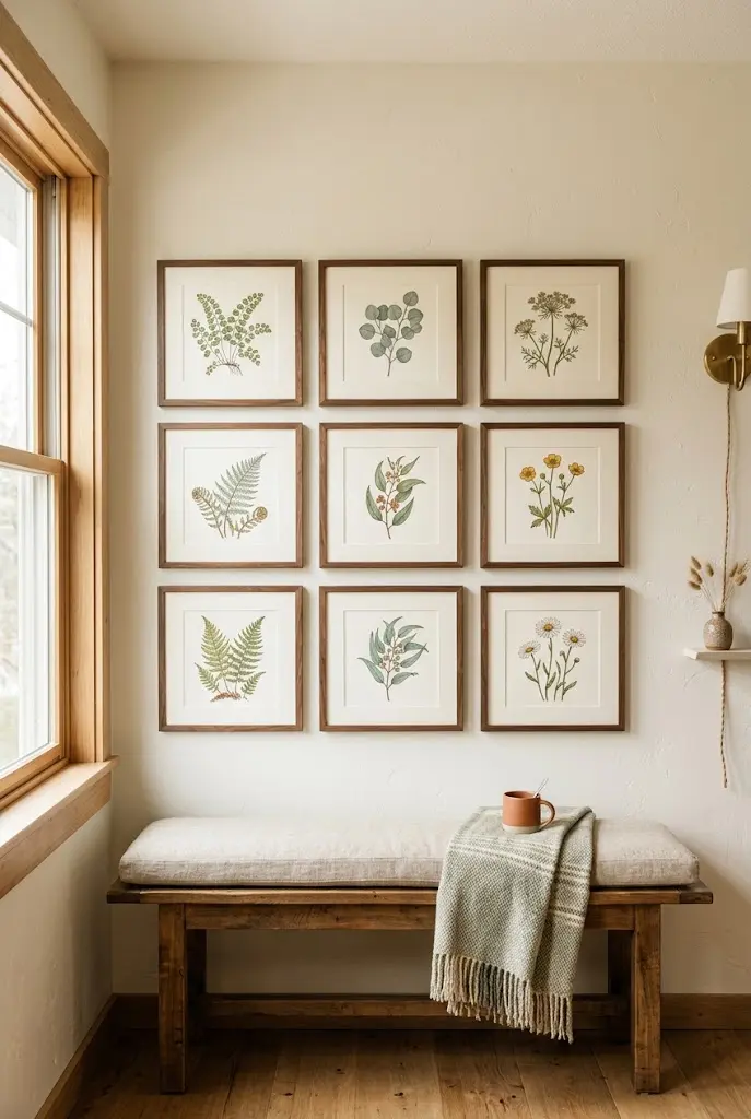
Botanical prints give a gallery wall a consistent subject without making every piece identical. Mix leaf studies, pressed-flower arrangements, and floral illustrations in matching frames, and the wall feels like a collection.
Use off-white or cream mats to give the plant details room. It works well in dining rooms and breakfast nooks, where the soft color palette complements wood furniture.
Common Mistake: Mixing too many color-saturated florals. Better Approach: Choose prints with a restrained palette of greens, creams, and one accent.
11. Thrifted Frame Collection
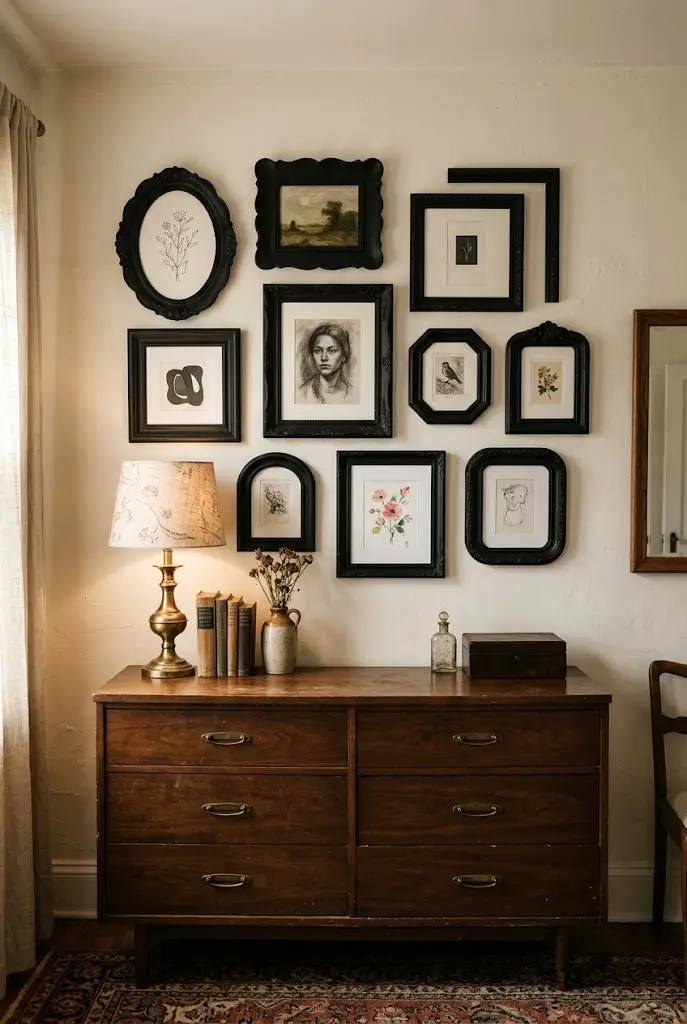
Secondhand frames are some of the most affordable ways to build a layered gallery wall. Gather mismatched frames from thrift stores and flea markets, then unify them with a single coat of paint, such as matte black, warm white, or soft brass spray.
Swap in new mats and your own prints, and the old frames feel intentional. Check glass for chips and make sure hanging hardware is sound.
- Remove backing and clean the glass.
- Lightly sand glossy finishes.
- Paint in one cohesive color family.
- Add new mats and prints.
12. Family Photo Wall With Cohesive Mats
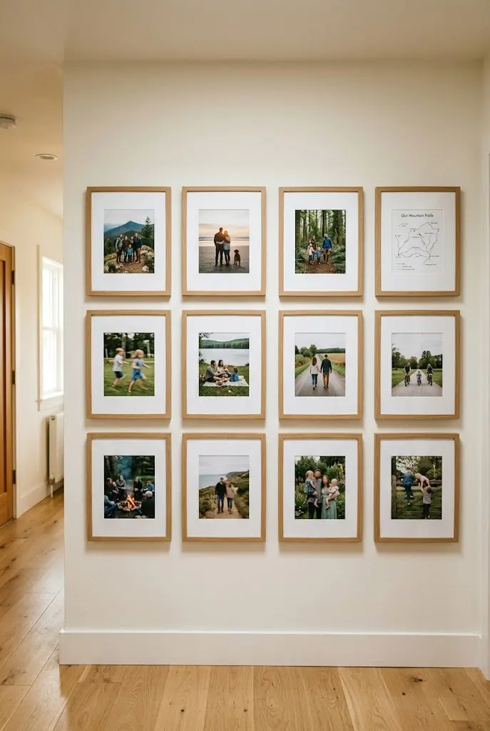
Family photos can look scattered when they come in different crops and color tones. Consistency in matting solves much of it. Use one mat color and consistent frame finishes, and the photos read as a deliberate collection.
Consider converting a few to black-and-white if the color tones vary widely. Mix in a few non-photo pieces, such as a map or small drawing, to keep the wall from feeling like a single-purpose display.
- Print at consistent sizes where possible.
- Use wide mats so smaller photos look substantial.
- Leave space to add future photos.
13. Baskets and Plates Wall (No Frames Needed)
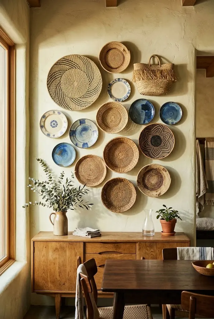
A gallery wall doesn’t need frames. Woven baskets, ceramic plates, and wall-hung bowls create texture and pattern in place of art. Group odd numbers of items, vary diameters, and alternate materials, such as rattan and glazed ceramic.
Plate hangers and basket hooks are widely available and inexpensive. This approach is especially good in kitchens, dining areas, and casual living spaces.
Editor’s Note: Leave 2 to 3 inches between items, so each shape reads separately rather than blurring into one mass.
14. Dark and Moody Backdrop
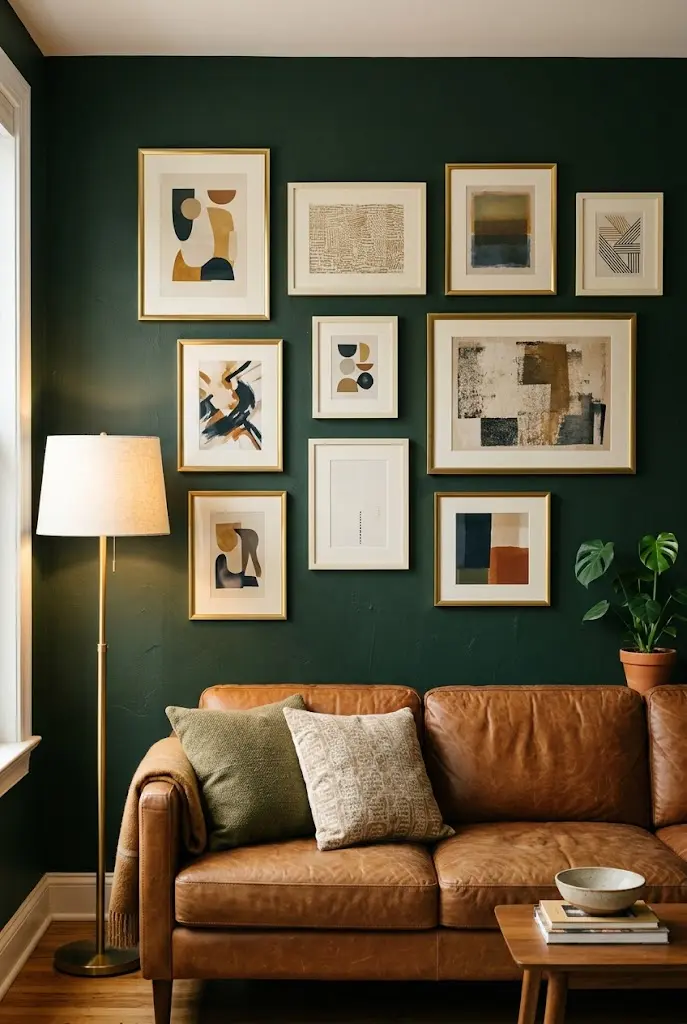
Painting the wall a deep color, such as forest green, navy, or charcoal, makes frames stand out and gives a gallery wall drama. Light mats and brass or white frames show up especially well against dark walls.
This is one of the more affordable ways to change the look of a gallery wall, since paint costs little compared to the effect it has. Use matte or eggshell finishes to minimize glare.
Do: Choose frames with contrast against the paint.
Don’t: Use dark frames on a dark wall unless you want a tonal, subtle effect.
15. Single-Line Hallway Row
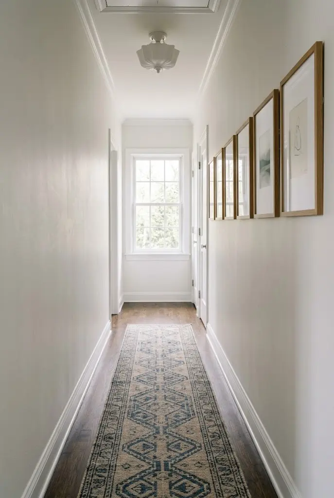
In a long, narrow hallway, a single horizontal row of frames at consistent height works better than a cluster. The repeating rhythm gives the corridor direction and keeps it from feeling cramped.
Use frames of similar height, even if widths differ. Space them evenly and center the row at a comfortable eye level. Shallow frames protect against bumps.
Quick Facts
Best For: Hallways, corridors
Investment: Accessible to moderate
Visual Effect: Adds rhythm and draws the eye down the length
16. Rotating Kids’ Art Wall With Clip Rails
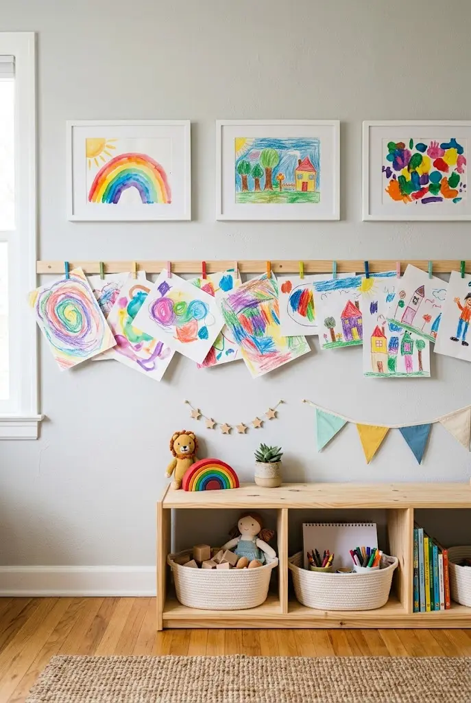
Children produce art faster than any frame collection can keep up with. A rail with clips, a wire with mini clothespins, or a magnetic rail lets you rotate pieces without making new holes.
Mix kids’ drawings with a few framed pieces for structure. Keep the layout orderly, even if the art itself is playful.
- Use a wire or rail to define a clear boundary.
- Frame one or two favorites as permanent anchors.
- Rotate pieces monthly to keep it fresh.
17. Home Office Wall With Prints, Maps, and Objects
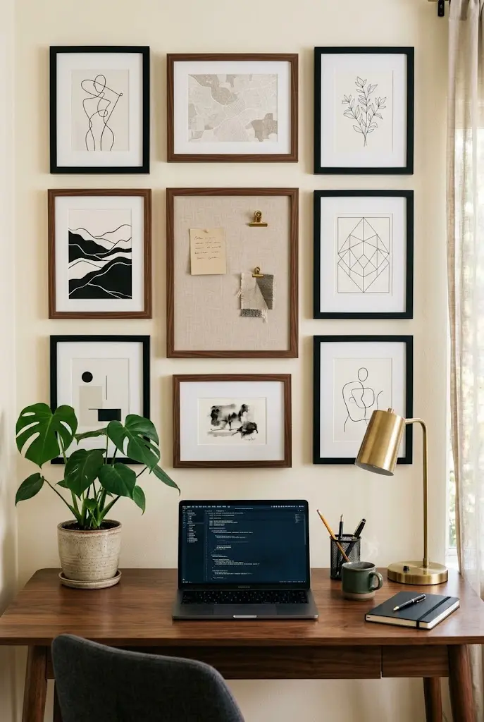
A home office gallery wall can mix art with useful pieces: a small corkboard, a calendar frame, a map, and a few prints. The goal is a wall that’s pleasant to look at between tasks without becoming visual noise behind video calls.
Keep the arrangement within the camera’s background area if you take calls, and choose calm, uncluttered images.
Tips & Tricks
- Mix one functional piece for every four decorative ones.
- Use consistent frame color for the decorative pieces.
- Position the arrangement slightly off-center to avoid looking staged on camera.
18. Brass and Gold Frame Collection
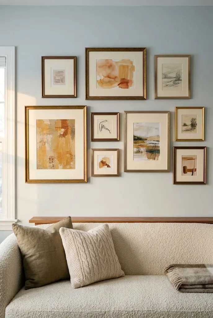
Metallic frames bring warmth to a gallery wall, especially against cool paint colors. Mix brushed brass, antique gold, and warm bronze finishes for variation without clashing.
This works well in living rooms and dining rooms that already have brass lighting or hardware. Pair with cream mats and prints in warm or neutral tones.
| Finish | Effect | Pairs With |
|---|---|---|
| Brushed brass | Soft, understated | Cream mats, neutral art |
| Antique gold | Traditional warmth | Oil-style landscapes |
| Bronze | Deeper, moodier | Dark walls, earthy tones |
19. Natural Wood Frame Scandinavian Wall
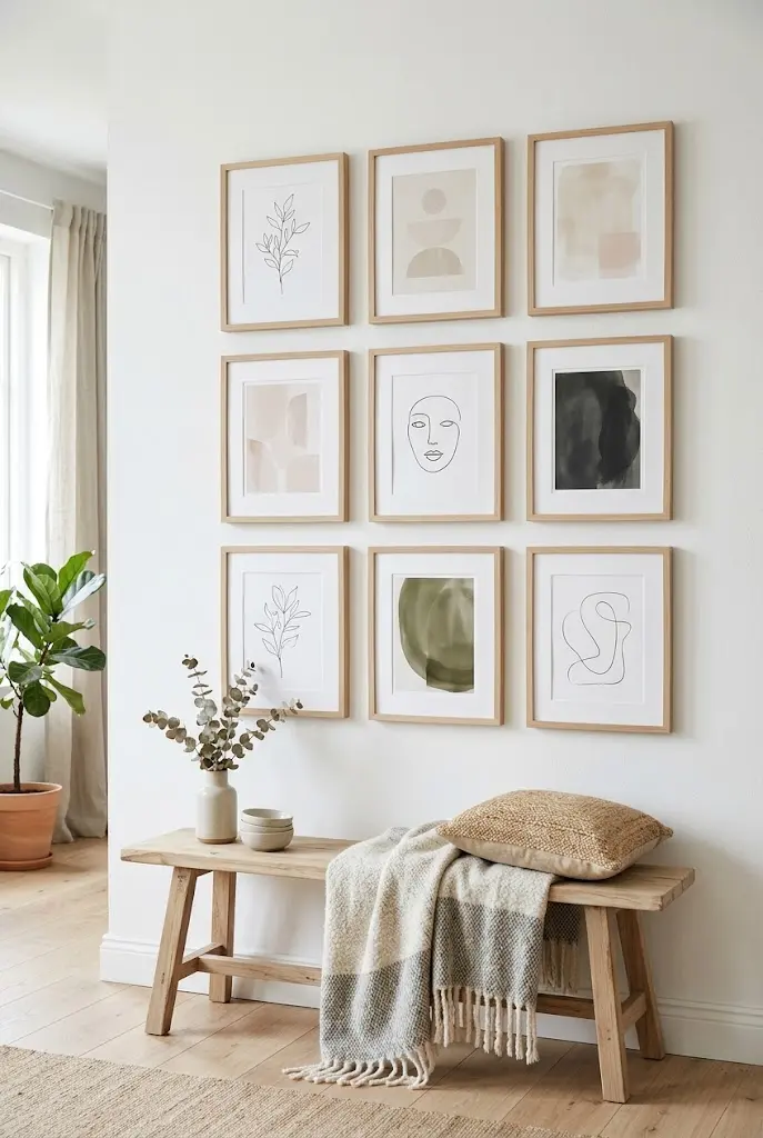
Light wood frames, such as oak, ash, and birch, support a calm, airy gallery wall. Use white mats, minimal prints, and plenty of white space inside each frame. The overall effect is soft and uncluttered.
It’s an accessible look that fits small apartments and bright rooms. Keep the prints simple: line drawings, soft abstracts, and quiet photography.
Common Mistake: Mixing too many wood tones. Better Approach: Stick to one or two closely related shades and let the art provide contrast.
20. Textiles and Tapestry Mix
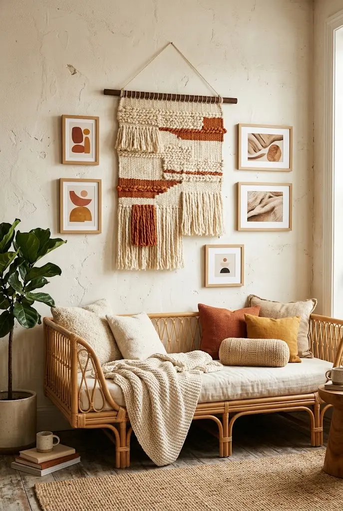
Woven wall hangings, small rugs, and fabric panels bring softness that glass and frames can’t. Combine one or two textiles with a few framed pieces, so the wall has both texture and structure.
Hang textiles from wooden dowels or clips rather than nails through the fabric. Natural fibers like wool and cotton work well, and they also help absorb a little sound in echoey rooms.
- Anchor the textile on one side, then balance with frames.
- Keep colors related across textile and prints.
- Avoid placing delicate fabrics in direct sun.
21. Tall, Narrow Column Beside a Window
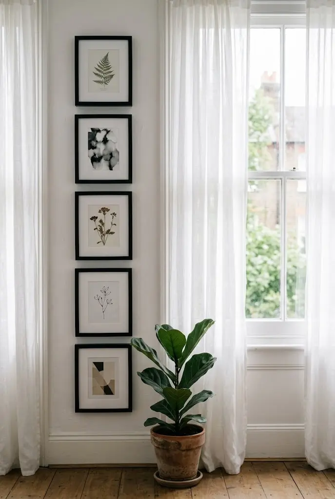
Slim walls beside windows or doors rarely get used, but a vertical column of frames suits them. Stack three to five frames in a single line, spaced evenly, to draw the eye upward.
This also helps rooms with low-feeling ceilings look taller. Choose frames with similar widths so the column reads as one element.
- Measure the available width and subtract a few inches of margin.
- Select frames that fit within it.
- Space them evenly and check the top and bottom alignment with nearby windows or doors.
22. Kitchen Nook With Food Still Lifes
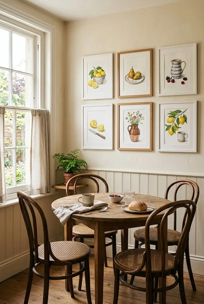
Kitchens welcome art that fits the room: still lifes of fruit, simple vegetable prints, or abstract color studies in warm tones. Keep frames moisture-tolerant and away from direct stove splatter.
A small gallery wall over a breakfast table or beside open shelving adds personality without taking counter space. Matte finishes are easier to wipe clean.
Quick Tip: Use acrylic or sealed prints near sinks, and keep fabric or paper art away from the cooktop.
23. Bathroom Gallery Wall
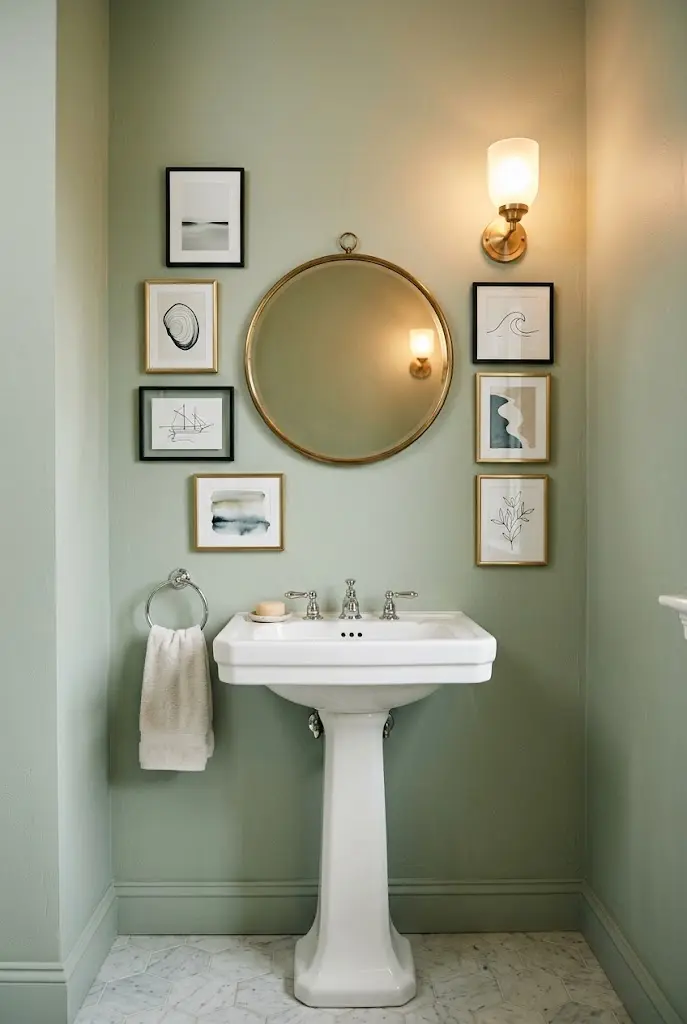
Bathrooms can host art too, as long as materials suit the humidity. Use frames with sealed backs, acrylic glazing, or prints on moisture-resistant material, and keep them away from direct shower spray.
Small groupings in powder rooms are especially effective, since guests tend to take their time looking around. Try playful or moody art in a space that doesn’t have to match the rest of the house.
- Choose rust-resistant hardware.
- Ventilate the room well.
- Avoid valuable or irreplaceable paper art.
24. Soft Nursery Gallery
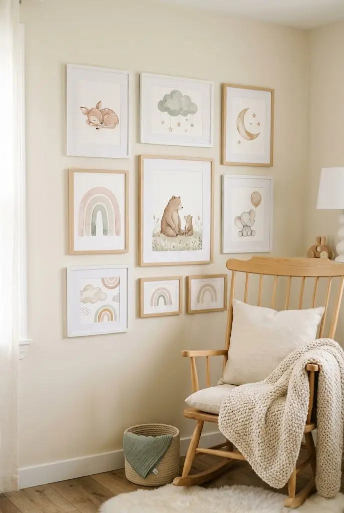
A nursery gallery works best with gentle colors and simple shapes: animals, soft landscapes, and abstract shapes in pastels or warm neutrals. Keep frames lightweight and well secured, and place them out of reach of cribs and changing tables.
It’s a gallery wall that can grow with the child, since many prints suit an older kid’s room with a simple swap of one or two pieces.
Do: Use shatter-resistant glazing and secure hardware.
Don’t: Hang heavy frames directly over a crib.
25. Painted Arch Behind the Frames
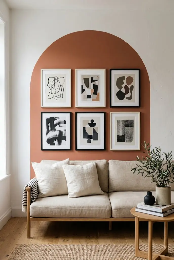
Painting a simple shape, such as an arch, rectangle, or circle, behind a group of frames gives the arrangement a defined boundary. A soft color like clay, sage, or warm gray makes frames look intentional.
It’s an inexpensive upgrade that also works for renters who can repaint later. Trace the shape with painter’s tape and a level before you paint.
- Sketch the shape lightly with a pencil.
- Tape the edge for a clean line.
- Paint two thin coats and remove the tape while the paint is slightly tacky.
26. Floor-to-Ceiling Salon Wall in a Tall Room
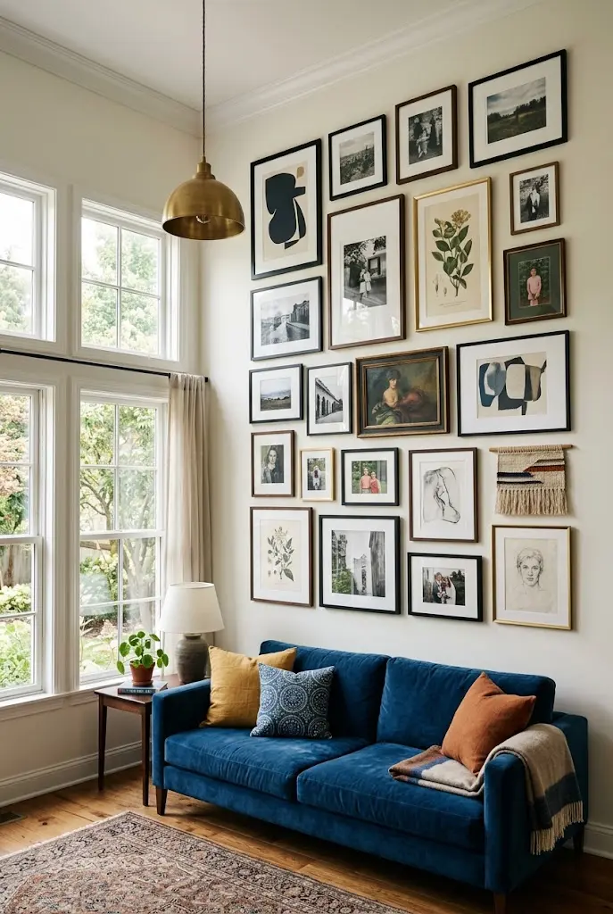
In rooms with high ceilings, a gallery wall can climb the whole wall for drama. Larger frames at the top, which are viewed from further away, balance smaller pieces at eye level.
This is a premium look that requires planning and often a ladder or professional installation. Consider picture lights or adjustable track lighting for the upper pieces.
Editor’s Note: Keep the most meaningful work at eye level and use the upper wall for bold, simple pieces that read from a distance.
27. Picture Rail Gallery
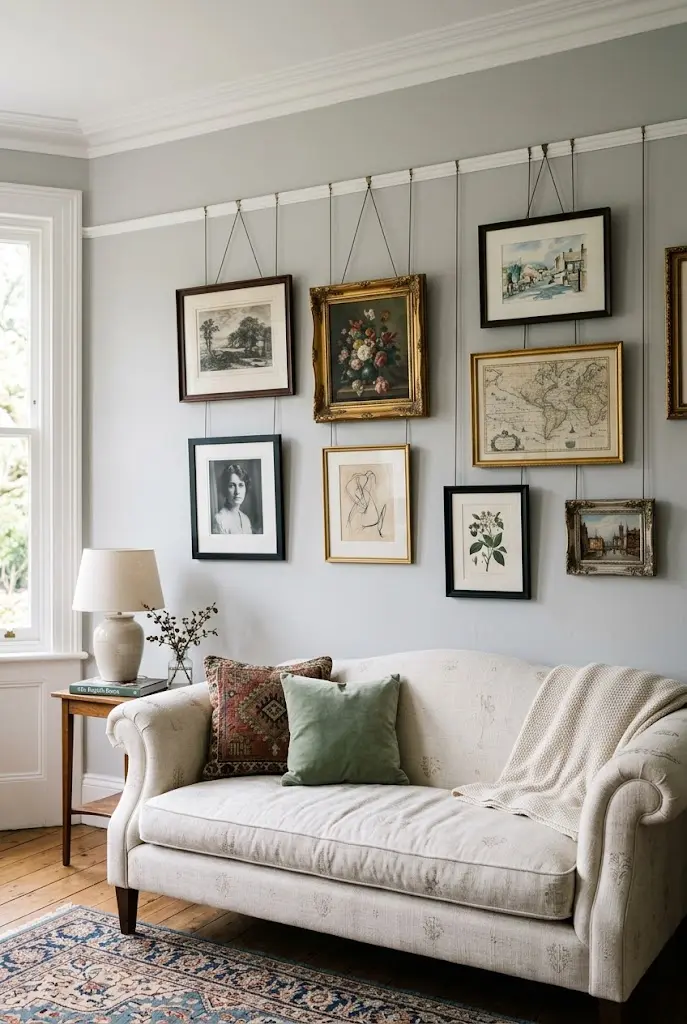
A picture rail is a molding mounted near the ceiling from which frames hang on adjustable cords or rods. It allows frequent rearranging without more holes and suits older or traditional homes beautifully.
It’s a premium, built-in approach, but one that makes rotating art easy. Hang pieces at varying lengths for a layered look.
| Hanging Method | Advantage | Best Fit |
|---|---|---|
| Cords | Flexible and soft look | Traditional rooms |
| Rods | Clean, rigid lines | Modern spaces |
| Chains | Decorative | Vintage-inspired rooms |
28. Built-In Bookcase and Art Hybrid
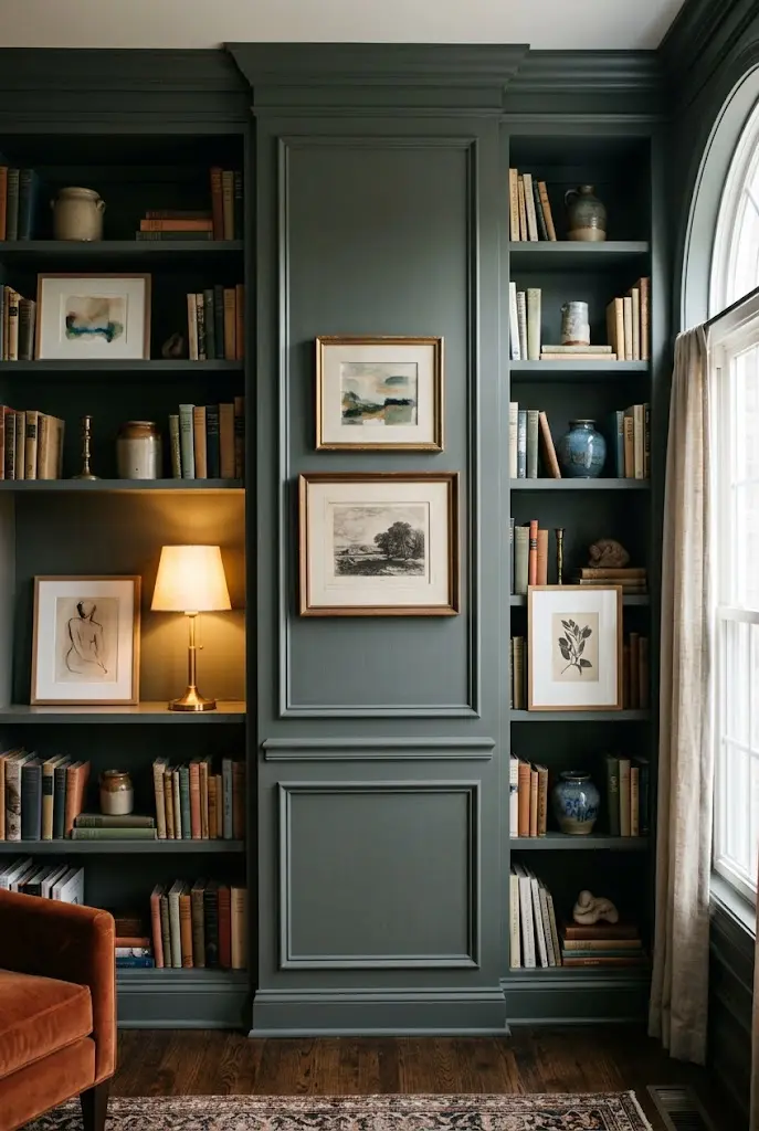
Mixing frames into built-in shelves creates a gallery that doubles as storage. Lean art against the back of shelves, leave open cubbies for objects, and place a few frames on the wall space between units.
This works best with built-ins, but a freestanding bookcase can do the same. Group books in varied ways, stacks and rows, to create rhythm.
- Leave a third of each shelf open for breathing room.
- Place larger art on lower shelves for stability.
- Add objects of varied heights, like ceramics or small sculptures.
29. Wallpapered Backdrop With Frames
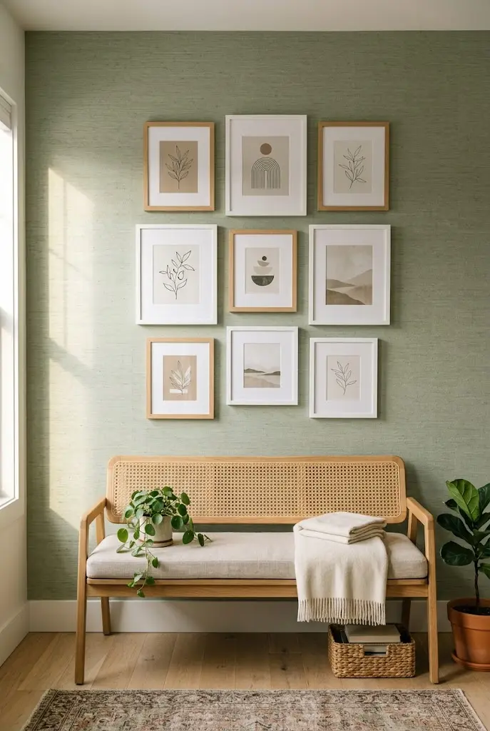
A patterned or textured wallpaper gives a gallery wall a built-in backdrop. Choose subtle designs such as grasscloth, tone-on-tone botanicals, or soft stripes so the art remains the focus.
Peel-and-stick options make this feasible for renters, though results depend on wall surface and product. Use frames in a solid, simple finish so they don’t compete.
Common Mistake: Hanging busy art on busy wallpaper. Better Approach: Match a quiet backdrop with varied art, or a bold backdrop with simple, minimal art.
30. Corner-Wrapping Gallery
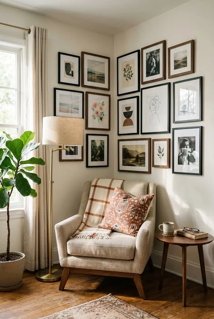
Wrapping a gallery wall around an inside corner connects two walls into one composition. It works well in rooms with a cozy seating area tucked into a corner.
Keep frames away from the exact corner line by a couple of inches, and balance larger pieces on one wall with smaller ones on the other. It takes careful measuring, but the effect feels custom.
Quick Facts
Best For: Reading corners, dining nooks
Investment: Accessible to moderate
Visual Effect: Makes the corner feel purposeful
31. Gallery Wall With Picture Lights
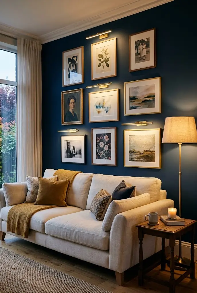
Small, dedicated picture lights above select frames give a gallery wall a museum-like glow in the evening. Plug-in and rechargeable versions simplify installation, while hardwired options offer the cleanest look.
Light only a few key pieces, not every frame. The contrast adds depth and draws attention to your favorites.
Tips & Tricks
- Choose warm bulbs for a comfortable glow.
- Place lights to avoid glare on glass.
- Hide cords where possible, or use rechargeable options.
Before You Hang Anything
A few habits make nearly every layout look better:
- Trace and tape. Cut paper to each frame’s size, tape it to the wall, and adjust before making holes.
- Anchor to furniture. Center the arrangement on the sofa, bed, or console, not just the wall.
- Hang at eye level. Museums commonly center art around 57 inches from the floor, which is a useful starting point.
- Keep consistent spacing. Equal gaps, often 2 to 3 inches, help varied frames feel related.
- Use the right hardware. Check weight ratings on adhesive strips, anchors, and hooks.
Choose Your Starting Point
You don’t need all 31 ideas. Pick one layout that suits your wall, one frame finish you already like, and a short list of art you own or want to collect. Start with the anchor piece, build outward, and leave a few gaps for future finds. Gallery walls tend to look best when they grow slowly and reflect what you actually love, so treat the first arrangement as a draft rather than a final answer.